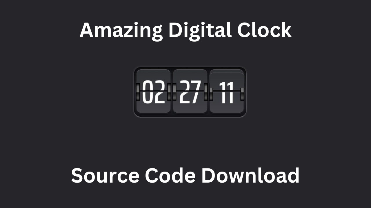
JavaScript Clock is a powerful computer language that assists software engineers in designing interactive internet programs. The project of creating a digital clock is one of the first and most entertaining undertakings for novices. This job will give you an opportunity to cement your knowledge of how time is managed in JavaScript, the manipulation of DOM, and the use of simple CSS styling. In this tutorial, we are going to take you through the process of building an online timepiece that shows the current time and updates itself every second.
HTML
- Create a Folder:
- You can create a new folder anywhere you’d like on your computer. Could you give it a name of your choice? For example, let’s call it “my website.”
- Inside the Folder:
- Open the newly created folder (“my-website” in our example).
- Inside this folder, create the following files:
- Create an
index.htmlFile:- Right-click inside the folder and choose New Text Document.
- Rename the newly created text document to “index.html” (make sure to remove the “.txt” extension).
- Open the “index.html” file using a text editor (such as Notepad or Visual Studio Code).
<!DOCTYPE html>
<html lang="en">

<head>
    <meta charset="UTF-8">
    <meta http-equiv="X-UA-Compatible" content="IE=edge">
    <meta name="viewport" content="width=device-width, initial-scale=1.0">
    <title>Document</title>

    <meta name="viewport" content="width=device-width, initial-scale=1">
    <link rel="preconnect" href="https://fonts.gstatic.com">
    <link
        href="https://fonts.googleapis.com/css2?family=Barlow+Condensed&family=Barlow:wght@600&family=Saira+Extra+Condensed:wght@500&display=swap"
        rel="stylesheet">
    <link rel="stylesheet"
        href="https://cdnjs.cloudflare.com/ajax/libs/material-design-icons/3.0.2/iconfont/material-icons.min.css">
    <link rel="stylesheet" href="https://cdnjs.cloudflare.com/ajax/libs/twitter-bootstrap/4.5.0/css/bootstrap.min.css">

</head>

<body>

    <div class="clock">
        <div class="flipper">
            <div class="gear"></div>
            <div class="gear"></div>
            <div class="top">
                <div class="text">00</div>
            </div>
            <div class="bottom">
                <div class="text">00</div>
            </div>
        </div>
    </div>


    <script src="https://cdnjs.cloudflare.com/ajax/libs/jquery/3.5.1/jquery.min.js"></script>
    <script src="https://cdnjs.cloudflare.com/ajax/libs/twitter-bootstrap/4.5.3/js/bootstrap.min.js">
</body>

</html>
CSS
2. Create a style.css File:
- Right-click inside the folder again and choose New Text Document.
- Rename the newly created text document to
style.css(remove the “.txt” extension). - Open the
style.cssfile using a text editor.
        /*
font-family: 'Barlow', sans-serif;
font-family: 'Barlow Condensed', sans-serif;
font-family: 'Saira Extra Condensed', sans-serif;
*/
        :root {
            --bgcolor: rgb(38, 37, 41);
            --clockheight: 220px;
            --radius: 30px;
            --rotationtime: 0.55s;
            --avobg: rgb(227, 246, 104);
        }

        html {
            box-sizing: border-box;
        }

        html *,
        html *::before,
        html *::after {
            box-sizing: inherit;
            padding: 0;
            margin: 0;
        }

        body {
            margin: 0;
            display: flex;
            height: 100vh;
            align-items: center;
            justify-content: center;
            background-color: var(--bgcolor);
            color: #fff;
            font-family: "Saira Extra Condensed", sans-serif;
        }

        .clock {
            display: grid;
            padding: 0 12px;
            grid-template-columns: 1fr 1fr 1fr;
            grid-column-gap: 12px;
            min-width: 200px;
            height: var(--clockheight);
            /*   background: rgb(26, 25, 28); */
            border-radius: var(--radius);
            /*   background-repeat: no-repeat; */
            background-image: linear-gradient(rgb(14, 14, 15) 0%,
                    rgb(26, 25, 28) 20%,
                    rgb(44, 44, 52) 50%,
                    rgb(20, 20, 27) 100%);
            /*   border-top: 6px solid rgb(56, 56, 61); */
            /*   border-bottom: 6px solid rgb(59, 59, 65); */
            box-shadow: inset 0 -3px 6px 3px rgba(0, 0, 0, 0.2),
                inset 0 4px 8px 3px rgba(0, 0, 0, 0.4),
                0 2px 3px 1px rgba(255, 255, 255, 0.3), 0 -2px 4px 4px rgba(56, 56, 61, 0.5);
        }

        .flipper {
            /*   border: 1px solid #c00; */
            position: relative;
            width: 100%;
            min-width: 150px;
            height: 100%;
            transform-style: preserve-3d;
            perspective: 1600px;
        }

        .gear {
            position: absolute;
            top: calc(var(--clockheight) / 3);
            width: 12px;
            height: calc(var(--clockheight) / 3);
            background: linear-gradient(to bottom,
                    #000000 0%,
                    #666666 17%,
                    #7f7f7f 52%,
                    #7f7f7f 52%,
                    #0c0c0c 53%,
                    #595959 87%,
                    #131313 100%);
            outline: 3px solid #000;
            z-index: 99;
            transform-style: preserve-3d;
            transform: translateZ(10px);
            perspective: 0;
        }

        .gear:nth-child(2) {
            left: calc(100% - 12px);
        }

        .top,
        .bottom {
            box-shadow: 0 6px 6px 1px rgba(0, 0, 0, 0.5),
                0 2px 2px 1px rgba(255, 255, 255, 0.15);
            border-top: 2px solid rgb(102, 103, 110);
            border-bottom: 2px solid #000;
            /*   transition: all 1s ease-in-out; */
        }

        .top {
            /*   border: 1px solid #c00; */
            position: relative;
            width: 100%;
            height: calc(50% - 15px);
            background-image: linear-gradient(rgb(48, 49, 53) 0%, rgb(56, 57, 62) 100%);
            margin-top: 10px;
            margin-bottom: 5px;
            border-top-left-radius: calc(var(--radius) * 0.65);
            border-top-right-radius: calc(var(--radius) * 0.65);
        }

        .bottom {
            position: relative;
            /*   border: 1px solid green; */
            width: 100%;
            height: calc(50% - 15px);
            background-image: linear-gradient(rgb(57, 58, 63) 0%, rgb(65, 65, 71) 100%);
            margin-top: 5px;
            margin-bottom: 10px;
            border-bottom-left-radius: calc(var(--radius) * 0.65);
            border-bottom-right-radius: calc(var(--radius) * 0.65);
        }

        .text {
            font-size: 140px;
            display: block;
            position: absolute;
            overflow: hidden;
            width: 100%;
            height: 100%;
            line-height: 193px;
            text-align: center;
        }

        .bottom .text {
            line-height: 0;
        }

        .top.new,
        .bottom.new {
            position: absolute;
            left: 0;
            z-index: 12;
            /*   background: green; */
        }

        .top.new {
            top: 0;
            z-index: 1;
            /*   backface-visibility: hidden; */
        }

        .top.new .text {
            backface-visibility: hidden;
        }

        /* .top.new:before {
  content: "";
  position: absolute;
  top: calc(var(--clockheight) / 3);
  left: 0;
  width: 15px;
  height: calc(var(--clockheight) / 3);
  background: #000;
}
.top.new:after {
  content: "";
  position: absolute;
  top: calc(var(--clockheight) / 3);
  right: 0;
  width: 15px;
  height: calc(var(--clockheight) / 3);
  background: #000;
} */
        .bottom.new {
            /*   background: red; */
            position: absolute;
            top: 0;
            height: calc(100% - 0px);
            transform: rotateX(0.5turn);
            /*   backface-visibility: hidden; */
            z-index: 1;
            opacity: 0;
        }

        .flipper.flipping .top.new {
            transform-origin: bottom center;
            /*   transform: rotateX(-180deg) translateY(-10px); */
            animation: rotate var(--rotationtime) 1 ease-in-out forwards;
        }

        .flipper.flipping .bottom.new {
            animation: rotatebottom var(--rotationtime) 1 ease-in-out forwards;
        }

        @keyframes rotatebottom {
            0% {
                opacity: 0;
            }

            49% {
                opacity: 0;
            }

            50% {
                opacity: 1;
            }

            100% {
                opacity: 1;
            }
        }

        @keyframes rotate {
            0% {
                transform: rotateX(0) translateY(0px);
            }

            100% {
                transform: rotateX(-180deg) translateY(-10px);
            }
        }
JavaScript
3. Create a script.js File:
- Right-click inside the folder once more and choose “New” > “Text Document.”
- Rename the newly created text document to “script.js” (remove the “.txt” extension).
- Open the “script.js” file using a text editor.
<script>var myhour, myminute, mysecond;

        function flipNumber(el, newnumber) {
            var thistop = el.find(".top").clone();
            var thisbottom = el.find(".bottom").clone();
            thistop.addClass("new");
            thisbottom.addClass("new");
            thisbottom.find(".text").text(newnumber);
            el.find(".top").after(thistop);
            el.find(".top.new").append(thisbottom);
            el.addClass("flipping");
            el.find(".top:not(.new)").find(".text").text(newnumber);
            setTimeout(function () {
                el.find(".bottom:not(.new)").find(".text").text(newnumber);
            }, 500);
        }
        function setTime() {
            $(".flipper").removeClass("flipping");
            $(".flipper .new").remove();
            var date = new Date();
            var seconds = date.getSeconds().toString();
            if (seconds.length == 1) {
                seconds = "0" + seconds;
            }
            var minutes = date.getMinutes().toString();
            if (minutes.length == 1) {
                minutes = "0" + minutes;
            }
            var hour = date.getHours();
            if (hour > 12) {
                hour = hour - 12;
            }
            if (hour == 0) {
                hour = 12;
            }
            hour = hour.toString();
            if (hour.length == 1) {
                hour = "0" + hour;
            }
            if ($(myhour[0]).text() !== hour) {
                flipNumber($(myhour[0]).closest(".flipper"), hour);
            }
            if ($(myminute[0]).text() !== minutes) {
                flipNumber($(myminute[0]).closest(".flipper"), minutes);
            }
            if ($(mysecond[0]).text() !== seconds) {
                flipNumber($(mysecond[0]).closest(".flipper"), seconds);
            }
            setTimeout(function () {
                setTime();
            }, 500);
        }

        $(function () {
            myhour = $(".clock .flipper:nth-child(1) div:not(.new) .text");
            myminute = $(".clock .flipper:nth-child(2) div:not(.new) .text");
            mysecond = $(".clock .flipper:nth-child(3) div:not(.new) .text");
            setTime();
        });
And in case you guys are getting any errors then make sure to solve them, what I did is create a folder for you people within the ZIP file |go and download it below| and have this downloaded so special thanks from James Bush. you will get the link