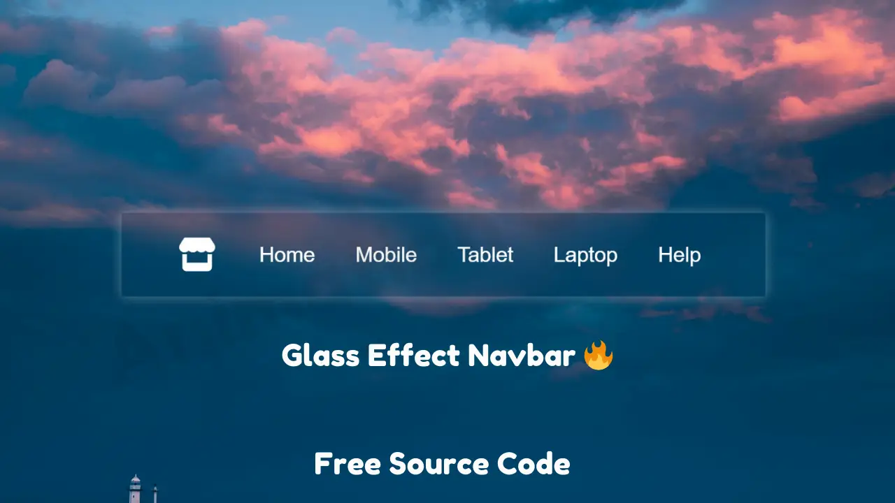
Create a Stunning Glass Effect Navbar
Creating a glass effect navbar can elevate the visual appeal of your website, adding a modern and sophisticated touch. Create a Stunning Glass Effect Navbar This guide will walk you through the process, detailing each step to ensure your navbar not only looks stunning but also functions seamlessly.
Table of Contents
Understanding the Glass Effect
The glass effect, often referred to as “frosted glass,” simulates the appearance of translucent glass. This effect is achieved by layering transparency, blurring background elements, and incorporating subtle shadows and highlights. It adds depth and an elegant aesthetic to web design.
Setting Up Your HTML Structure
Start with a basic HTML structure for your navbar. This provides the foundation upon which we will apply our styles.
<!DOCTYPE html>
<html lang="en">

<head>
    <meta charset="UTF-8">
    <title>Animationcoding</title>
    <link href="https://cdn.jsdelivr.net/npm/[email protected]/font/bootstrap-icons.css" rel="stylesheet">
    <link rel="stylesheet" href="https://cdnjs.cloudflare.com/ajax/libs/font-awesome/5.15.3/css/all.min.css">
    <link rel="stylesheet" href="https://cdnjs.cloudflare.com/ajax/libs/font-awesome/6.5.2/css/all.min.css">
</head>
<body>
    <nav>
        <ul>
            <li class="logo">
                <i class="fa-solid fa-store"></i>
            </li>
            <li><a href="" class="menu">Home</a> </li>
            <li><a href="" class="menu">Mobile</a></li>
            <li><a href="" class="menu">Tablet</a></li>
            <li><a href="" class="menu">Laptop</a></li>
            <li><a href="" class="menu">Help</a></li>
        </ul>
    </nav>
</body>
</html>
Crafting the CSS for the Glass Effect
Now, let’s create the CSS that will transform our plain navbar into a glass-like masterpiece. We will use modern CSS features such as backdrop-filter, rgba colors, and box shadows to achieve this effect.
Basic Styles for the Navbar
First, apply basic styles to ensure our navbar is correctly positioned and visually distinct.
body {
    margin: 0;
    font-family: Arial, sans-serif;    <style>
        body {
            display: grid;
            place-content: center;
            height: 100vh;
            margin: 0;
            font-family: sans-serif;
            /* background: linear-gradient(45deg, #00fffc, #000); */
            background: url(https://cdn.discordapp.com/attachments/1226604817225482421/1253033417222651955/sunset-3563482_1920.jpg?ex=667461ce&is=6673104e&hm=dbdc825d4a6221ef6181b202786d5a7f33e0e5feb16046bcf971c7a4aa30c294&);
            background-position: center;
            background-size: cover;
        }

        nav {
            /* backdrop-filter: blur(30px);
			-webkit-backdrop-filter: blur(3px); */
            border-radius: 5px;
            /* box-shadow:  10px 10px 30px 0 rgba(22, 32, 220, 0.37); */
            padding-right: 35px;
            /* border: 1px solid rgba(255, 255, 255, 0.18); */
            width: 1500px;
            height: 200px;
        }

        nav {
            backdrop-filter: blur(30px);
            box-shadow: 0px 0px 30px 0 rgba(227, 228, 237, 0.37);
            border: 2px solid rgba(255, 255, 255, 0.18);
        }

        ul {
            display: flex;
            gap: 5rem;
            list-style: none;
            justify-content: center;
            align-items: center;
            height: 85%;
        }

        ul li {
            color: #fff;
            display: grid;
            place-content: center;
            margin: 0;
        }

        .logo {
            /* color: #0f1cdd; */
            color: #fff;
            cursor: pointer;
            font-size: 5rem;
            position: relative;
            right: 15px;
        }

        .menu {
            color: #fff;
            padding: 0.5rem;
            position: relative;
            text-decoration: none;
            font-size: 50px;
        }

        .menu::before {
            content: "";
            position: absolute;
            width: 100%;
            height: 2px;
            background: #fff;
            border-radius: 5px;
            transform: scaleX(0);
            transition: all .5s ease;
            bottom: 0;
            left: 0;
        }

        .menu:hover::before {
            transform: scaleX(1);
        }
    </style>
    background: url('background.jpg') no-repeat center center fixed;
    background-size: cover;
}

.navbar {
    position: fixed;
    width: 100%;
    top: 0;
    left: 0;
    display: flex;
    justify-content: center;
    padding: 15px 0;
    z-index: 1000;
}
if you have any problem with this code don’t worry you can download this file.