
Hello Everyone Welcome to Animation Coding How Are You I Hope You All Are Doing Great
Today I Am Going To Give You The Top 5 Best Buttons By Using Them You Can Improve Your Design A Lot. You Can Use Them Anywhere, There Will Be No Problem With This, No One Will Give You A Copyright, If There Is Any Problem Then You Guys Message Me, Will Also Give Solution, Okay?
And The Button That I Am Going To Give You, You Will Not Get Button Anywhere Else, Even If You Get It, You Can Do It From There As Well, And The One That I Am Providing To You,
You Can Do It From Here As Well, And What Does Doing It From Here Mean That I Am Giving It To You Free If You See Somewhere Else That There Was A Tree There.
There Is No Need To Buy The Tree, You Can Download It Right Here, I Am Providing It Along With The Source Code, And I Have Also Made Its Pack In A Zip File.
You Will Get The Download Link, If You Scroll Down, You Will Get The Download Link Along With The Pack
Personal Portfolio Link
Table of Contents
Top 5 Best Buttons Check out
No.1 Button

HTML
<button class="button">
  <svg
    class="send-icon"
    xmlns="http://www.w3.org/2000/svg"
    width="48"
    height="48"
    viewBox="0 0 24 24"
  >
    <path
      fill="currentColor"
      fill-opacity="0.4"
      d="m16.066 10.184l-3.89-1.795c-2.154-.994-3.231-1.491-3.725-.982c-.493.509.038 1.572 1.101 3.698c.22.44.33.659.33.895s-.11.456-.33.895c-1.063 2.126-1.594 3.19-1.1 3.698c.493.51 1.57.012 3.725-.982l3.889-1.795c1.698-.784 2.548-1.176 2.548-1.816c0-.64-.85-1.032-2.549-1.816"
    ></path>
    <path
      fill="currentColor"
      d="M8.895 11.684L8.174 9.52a1 1 0 0 0-.707-.654l-1.78-.445a.8.8 0 0 0-.91 1.134l1.111 2.22a.5.5 0 0 1 0 .448l-1.11 2.22a.8.8 0 0 0 .91 1.134l1.78-.445a1 1 0 0 0 .706-.654l.72-2.163a1 1 0 0 0 0-.632"
    ></path>
  </svg>
  Send Message
</button>
CSS
.button {
  display: inline-flex;
  align-items: center;
  padding: 10px 20px;
  background-color: #fefefe;
  border: 1px solid #dcdcdc;
  border-radius: 12px;

  font-family: "Ubuntu", sans-serif;
  font-size: 16px;
  font-weight: bold;
  color: #333;
  cursor: pointer;
  text-decoration: none;
  transition: all 0.3s ease;
  position: relative;
  overflow: hidden;
  z-index: 0;
  outline: 2px solid #fafafa;
  box-shadow: 9px 9px 44px #cecece3a, -9px -9px 44px #d3d3d33d,
    inset 0 0 0 2px rgba(192, 192, 192, 0.25);
}

.button::before {
  content: "";
  position: absolute;
  top: 3px;
  left: 3px;
  right: 3px;
  bottom: 3px;
  border-radius: 30px;
  background: linear-gradient(
    0deg,
    #fbfbfb 0%,
    #fafafa 5%,
    #f7f7f7 72%,
    #f2f2f2 86%,
    #f0f0f0 100%
  );
  box-shadow: inset 0 2px 7px rgba(143, 143, 143, 0.16);
  transition: all 0.3s ease;
  z-index: -1;
  margin: 2px;
}

.button:hover::before {
  top: 1px;
  left: 1px;
  right: 1px;
  bottom: 1px;
  margin: 5px;
}

.button:focus {
  outline: 2px solid #fefefe;
  box-shadow: 9px 9px 44px #cecece3a, -9px -9px 44px #d3d3d33d,
    inset 0 0 0 2px rgba(192, 192, 192, 0.5);
}

.send-icon {
  margin-right: 5px;
  transition: transform 0.3s ease;
}

.button:hover .send-icon {
  transform: translateX(7px);
}

.button:focus .send-icon {
  transform: rotate(-40deg);
}
No.2 Button
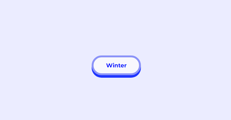
HTML
<button class="button">Winter</button>
CSS
.button {
  cursor: pointer;
  font-size: large;
  font-family: inherit;
  font-weight: bold;
  color: #0011ff;
  background-color: #f8f8fd;
  padding: 0.8em 2.2em;
  border-radius: 50em;
  border: 6px solid #8b93f8;
  box-shadow: 0px 8px #1f35ff;
}
.button:active {
  position: relative;
  top: 8px;
  border: 6px solid #646fff;
  box-shadow: 0px 0px;
}
No.3 Button
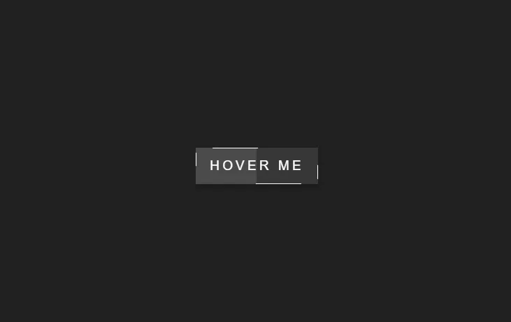
HTML
<button class="button">
  <span></span>
  <span></span>
  <span></span>
  <span></span>
  Hover Me
</button>
CSS
.button {
  cursor: pointer;
  position: relative;
  padding: 15px 20px;
  text-decoration: none;
  border: none;
  color: #fff;
  font-size: 1.2em;
  text-transform: uppercase;
  font-family: sans-serif;
  letter-spacing: 4px;
  overflow: hidden;
  background: rgba(255, 255, 255, 0.1);
  box-shadow: 0 5px 5px rgba(0, 0, 0, 0.2);
}
.button:before {
  content: "";
  position: absolute;
  top: 0;
  left: 0;
  width: 50%;
  height: 100%;
  background: rgba(255, 255, 255, 0.1);
}
.button::after {
  content: "";
  position: absolute;
  top: 0;
  left: -100%;
  width: 100%;
  height: 100%;
  background: linear-gradient(
    90deg,
    transparent,
    rgba(255, 255, 255, 0.4),
    transparent
  );
  transition: 0.5s;
  transition-delay: 0.5s;
}
.button:hover:after {
  left: 100%;
}
.button span {
  position: absolute;
  display: block;
  transition: 0.5s ease;
}
.button span:nth-child(1) {
  top: 0;
  left: 0;
  width: 0;
  height: 1px;
  background: #fff;
}
.button:hover span:nth-child(1) {
  width: 100%;
  transform: translateX(100%);
}
.button span:nth-child(2) {
  top: 0;
  left: 0;
  width: 1px;
  height: 0;
  background: #fff;
}
.button:hover span:nth-child(2) {
  height: 100%;
  transform: translateY(100%);
}
.button span:nth-child(3) {
  bottom: 0;
  right: 0;
  width: 0;
  height: 1px;
  background: #fff;
}
.button:hover span:nth-child(3) {
  width: 100%;
  transform: translateX(-100%);
}
.button span:nth-child(4) {
  bottom: 0;
  right: 0;
  width: 1px;
  height: 0;
  background: #fff;
}
.button:hover span:nth-child(4) {
  height: 100%;
  transform: translateY(-100%);
}
No.4 Button
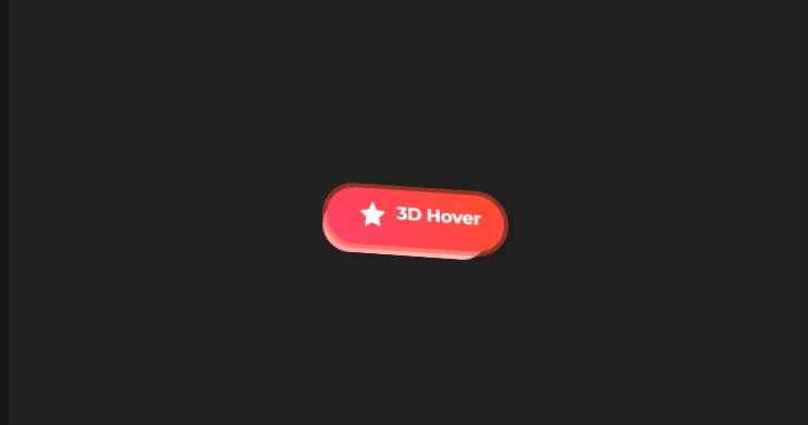
HTML
<button class="fancy-3d-button">
  <svg
    role="img"
    aria-hidden="true"
    xmlns="http://www.w3.org/2000/svg"
    viewBox="0 0 24 24"
    class="button-icon"
  >
    <path
      d="M12 .587l3.668 7.431L24 9.587l-6 5.845L19.335 24 12 20.01 4.665 24 6 15.432 0 9.587l8.332-1.569z"
    ></path>
  </svg>
  <span class="button-text">3D Hover</span>
</button>
CSS
.fancy-3d-button {
  display: inline-flex;
  align-items: center;
  justify-content: center;
  padding: 15px 30px;
  font-size: 1em;
  font-weight: 700;
  color: #fff;
  background: linear-gradient(45deg, #ff416c, #ff4b2b);
  border: none;
  border-radius: 50px;
  cursor: pointer;
  transition: all 0.6s ease-in-out;
  box-shadow: 0 8px 15px rgba(0, 0, 0, 0.2);
  perspective: 500px; /* Adding perspective for 3D effect */
  transform-style: preserve-3d; /* Preserve 3D transformations */
}

.fancy-3d-button::before {
  content: "";
  position: absolute;
  top: 0;
  left: 0;
  width: 100%;
  height: 100%;
  background: linear-gradient(45deg, #ff9a9e 0%, #fad0c4 100%);
  z-index: -1;
  transition: all 0.6s ease-in-out;
  transform: translateZ(-20px); /* 3D depth effect */
  border-radius: 50px;
}

.fancy-3d-button:hover::before {
  transform: translateZ(-40px); /* Enhance depth on hover */
}

.fancy-3d-button:hover {
  transform: rotateX(15deg) rotateY(15deg); /* Rotate on hover for 3D effect */
}

.fancy-3d-button:focus {
  outline: none;
  box-shadow: 0 0 0 4px rgba(255, 75, 43, 0.5);
}

.button-icon {
  width: 1.5em;
  height: 1.5em;
  margin-right: 0.5em;
  fill: currentColor;
  transition: transform 0.6s ease-in-out;
  transform: translateZ(10px); /* Bring SVG out for 3D effect */
}

.fancy-3d-button:hover .button-icon {
  transform: rotate(360deg) translateZ(10px); /* Rotate SVG on hover */
}

.button-text {
  z-index: 2;
  transform: translateZ(10px); /* Bring text out for 3D effect */
  transition: transform 0.6s ease-in-out;
}

.fancy-3d-button:hover .button-text {
  transform: translateZ(20px); /* Enhance depth on hover */
}
No.5 Button
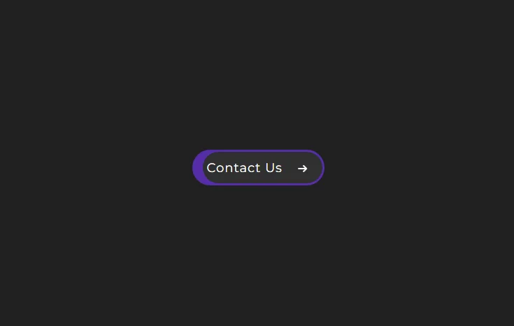
HTML
<button class="cta">
<span>Contact Us </span>
<svg viewBox="0 0 13 10" height="10px" width="15px">
<path d="M1,5 L11,5"></path>
<polyline points="8 1 12 5 8 9"></polyline>
</svg>
</button>
CSS
.cta {
  position: relative;
  margin: auto;
  padding: 11.5px 18px;
  transition: all 0.2s ease;
  border: 3px solid #552da8;
  border-radius: 50px;
  background: #552da8;
  cursor: pointer;
}

.cta:before {
  content: "";
  position: absolute;
  top: 0;
  right: 0;
  display: block;
  border-radius: 50px;
  background: white;
  width: 45px;
  height: 45px;
  transition: all 0.8s ease;
}

.cta span {
  position: relative;
  font-family: Montserrat;
  font-size: 18px;
  color: white;
  font-weight: 400;
  letter-spacing: 0.05em;
}

.cta svg {
  position: relative;
  top: 0;
  margin-left: 10px;
  fill: none;
  stroke-linecap: round;
  stroke-linejoin: round;
  stroke: white;
  stroke-width: 2;
  transform: translateX(-5px);
  transition: all 0.5s ease;
}

.cta:hover:before {
  width: 100%;
  background: #1c1c1c;
}

.cta:hover svg {
  transform: translateX(0);
  transition: all 2s ease;
}

.cta:active {
  transform: scale(0.95);
  transition: all 2s ease;
}